The idea
A signal is something small and clear that tells you what is coming.
The name comes from Signal Hill, where a gun has fired at noon over Cape Town every day since 1806. A daily, reliable pulse that the whole city sets its watch by. Signal Health does the same for a person: a regular reading, a clear message, a rhythm you can trust.
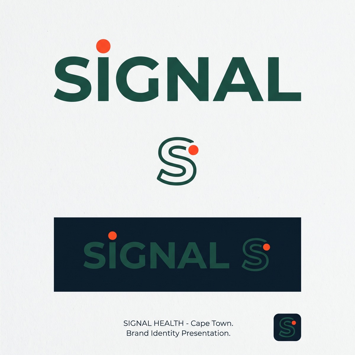
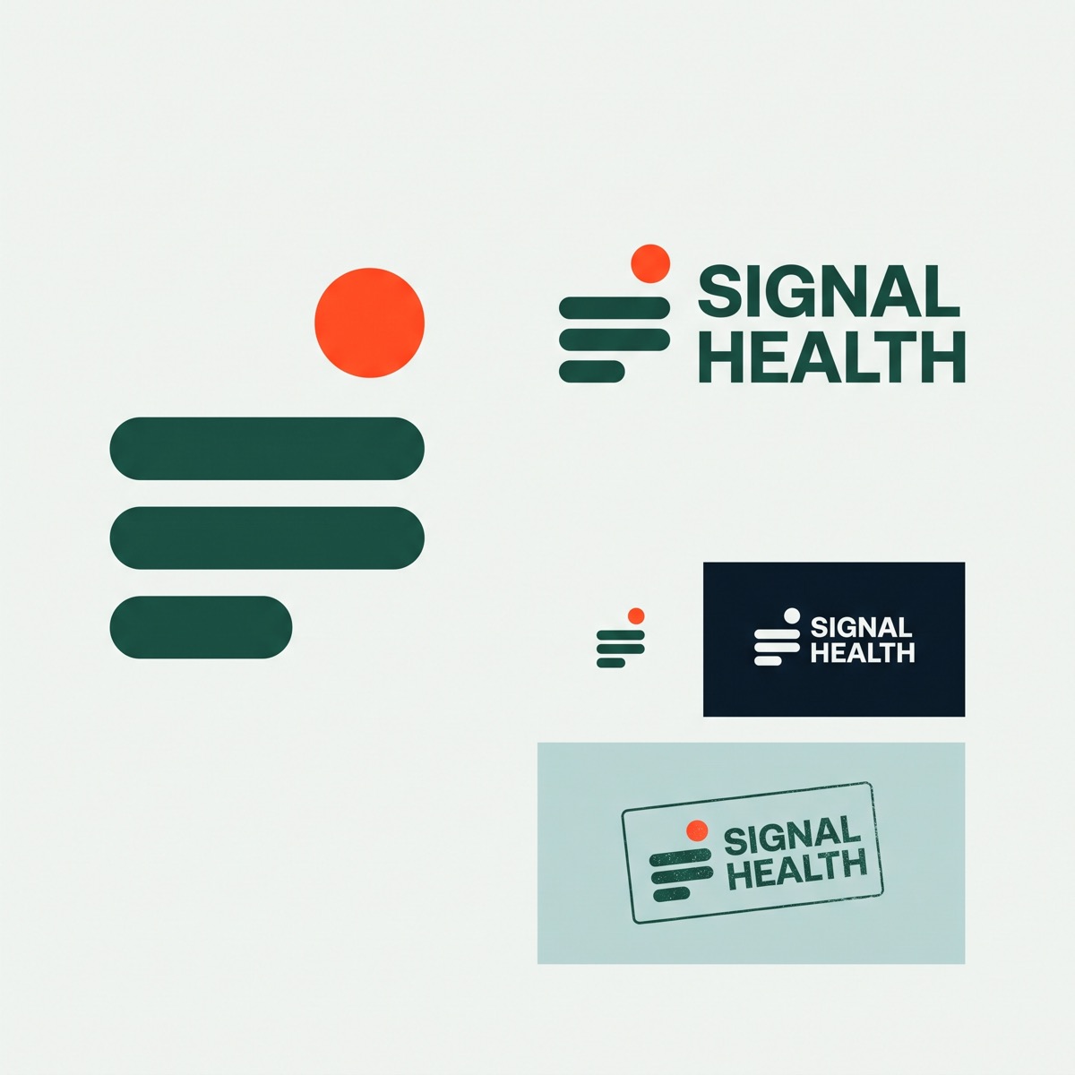
The brand has one memorable element, the flare. It is the small orange-red circle that sits over the i in the wordmark, rises over the horizon bars in the mark, and appears exactly where we want attention: a result that needs action, the button that books a visit, the place where you are in a process. Everything else is quiet: deep sea greens, cool paper, disciplined type.
Two words to check any design against: calm and precise. If it looks like a wellness spa or a hospital, it is wrong. It should look like a well-made instrument.
Logo
A wordmark for most uses, a mark for small spaces, and a lockup when both are needed.
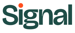
Wordmark, kelp on paper. The primary logo.
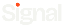
Wordmark reversed, paper on ink or kelp.

The mark. Flare over three horizon bars: sea, fog, land.

Mark reversed on kelp.

Lockup for letterheads, report headers and partners.

App icon and favicon.
Rules
- Clear space around the logo equals the height of the flare on every side.
- Minimum size: wordmark 90 px or 24 mm wide; mark 20 px or 6 mm.
- The wordmark says Signal. "Health" is written in running text, never bolted onto the logo.
- Only two colourways: kelp with flare on light backgrounds, paper with flare on dark ones.
Never
- Recolour the flare. It is always Flare orange.
- Stretch, rotate, outline, add shadows or gradients.
- Place the logo on photography without the ink gradient behind it.
- Set the word Signal in another typeface to imitate the wordmark.
Colour
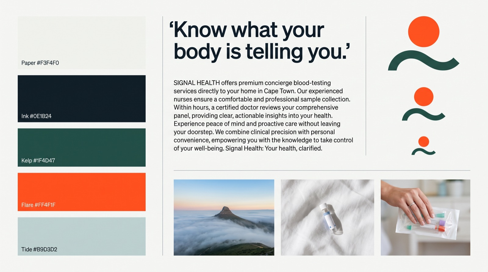
Cool, coastal, one hot point.
Proportion
Roughly seventy parts paper, twenty parts ink and kelp, eight parts tide, two parts flare. Flare is a point, never an area. If a layout has more than one flare element in view, remove one.
Contrast: Ink 2 on Paper 9.2:1, Kelp on Paper 7.6:1, Paper on Kelp 7.6:1, white on Flare 3.3:1 (large text and buttons only).
Type
A grotesque with opinions for headlines, a quiet serif for reading.
Rules
- Sentence case everywhere. No all-caps labels, no tracked-out eyebrows.
- Headlines tight: letter-spacing between -0.02 and -0.035 em, line-height under 1.05.
- Body text 60 to 70 characters a line, never wider.
- Prices and scores in Bricolage. Numbers are part of the voice.
- Google Fonts serves both families. Fallbacks: Helvetica Neue and Georgia.
Never
- Italic or coloured single words inside a headline for emphasis.
- Middle dots, arrows or dashes as decoration in labels and buttons.
- A third typeface, including monospace for data.
- Inter, Roboto, Arial or system fonts in anything customer-facing.
Voice
A calm expert who talks like a person.
We say what we do, what it costs, and what happens next. We do not sell, and we do not scare.
Principles
- Plain verbs, short sentences, active voice. "We come to you", not "home-based phlebotomy services are provided".
- Specific beats clever. Fifteen minutes, R695 a month, two visits a year.
- Honest about limits. Wellness and prevention, doctor-reviewed, not a diagnosis, not a replacement for your GP.
- Name the person. Nurse, doctor, you. Never "our team of experts" or "your health journey".
- No dashes as punctuation. Commas, full stops and colons do the work.
Words we avoid
- Journey, holistic, empower, unlock, optimise your life, cutting-edge, revolutionary.
- Biohacking and longevity as identity words. We measure, we do not preach.
- Any claim a doctor would not sign: cure, prevent, guarantee, diagnose.
- Exclamation marks.
Instead of
Unlock your optimal health with our revolutionary at-home longevity testing experience!
Our expert team is dedicated to empowering you on your wellness journey.
Results are typically available within 3-5 business days.
Write
A nurse draws your blood at home. A registered lab runs it. A doctor reads it. You get a plan.
Questions go to info@signalhealth.me and a person answers the same day.
Results in a few days, reviewed by a doctor.
Imagery
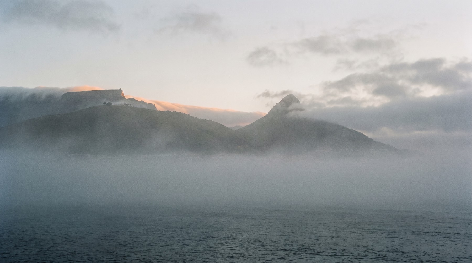
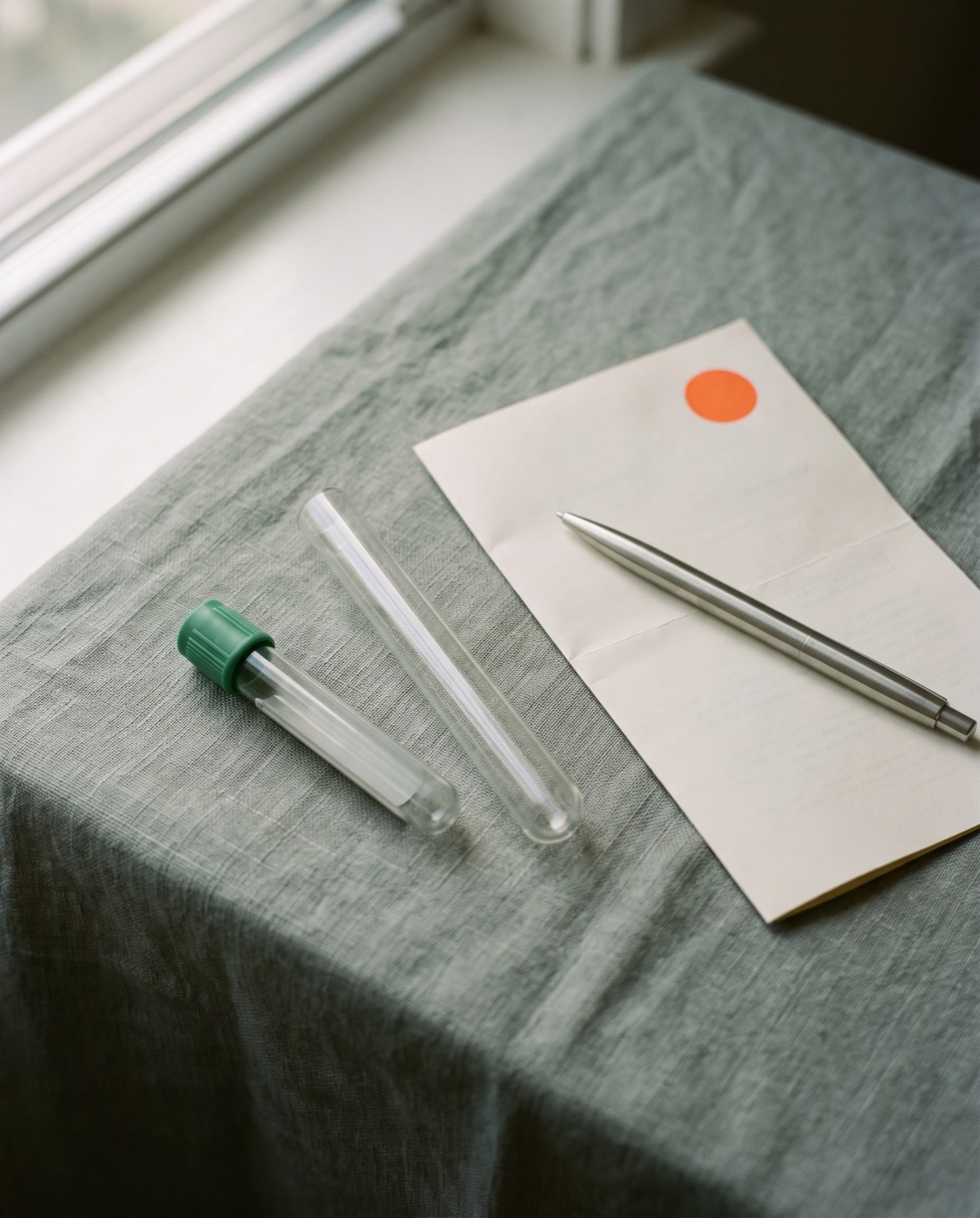
Weather, light and objects. Rarely people.
Direction
- Cape Town weather and coast: fog, first light, the Atlantic, the ridge. Quiet, cool, lots of sky.
- Still life on linen or paper: tubes, a report, a pen, a kit. North window light, soft shadows.
- Medium-format film feel: fine grain, low contrast, muted colour. One warm highlight at most.
- When people appear: hands, a doorway, a kitchen table. Never posed smiles, lab coats or stock nurses.
Never
- Needles, blood, syringes, gloves.
- DNA helices, glowing molecules, heartbeat lines, medical iconography.
- Purple or blue gradients, lens flares, HDR.
- Text or the logo over a photo without the ink gradient.
Files
Vector logos and the exploration sheets behind them.
- signal-wordmark.svgKelp on light
- signal-wordmark-ink.svgInk on light
- signal-wordmark-reversed.svgPaper on dark
- signal-mark.svgMark, kelp
- signal-mark-reversed.svgMark, paper
- signal-lockup.svgMark and wordmark
- signal-app-icon.svgIcon on ink, rounded
- signal.cssTokens and components for the web
Exploration
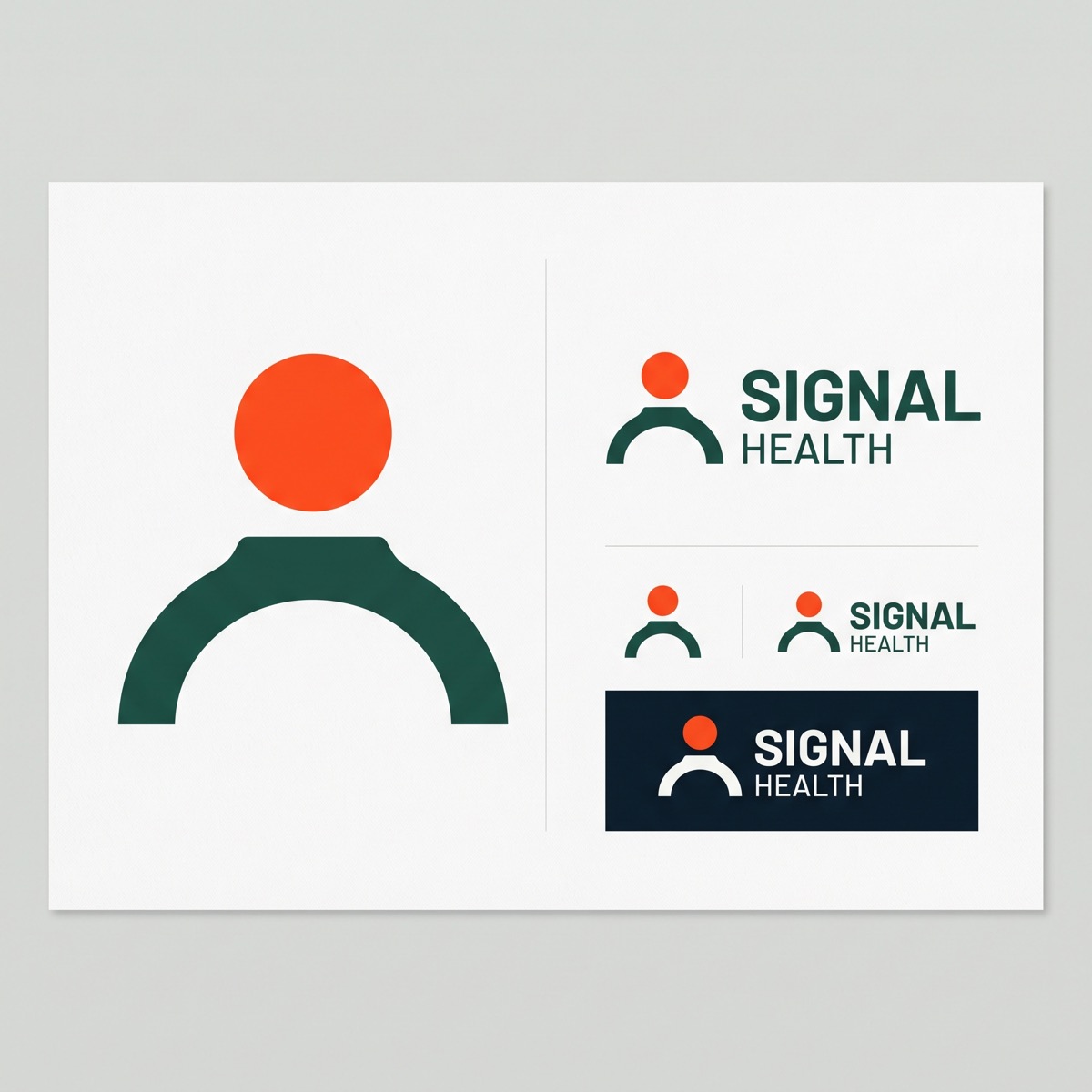
Three concept sheets and a board were generated to test directions. The chosen identity takes the flare-over-the-i from the wordmark sheet and the horizon bars from the mark sheet, then redraws both as clean vectors. The arc concept was dropped because it reads as a person icon.